Final Interface Aesthetic Project
- assa4664
- Dec 12, 2020
- 2 min read
FINAL FIGMA: Link
For my project I made an app for an artist. They could post news, their music as well as how the music is made, a merch shop, and tour dates. I based this off of existing websites that artists do for album promotion.
Some examples:
I actually based mine off Bastille, I wasn't aware they had a website until I was building out mine. I did use some of the material in their website in my app.
I see this being used as an extra content kind of thing. My favorite part being the screen where you select a song and it allows you to see the video but also the behind the scenes of how the song was created. It also allows for community engagement. Because it's so niche I see only a limited amount of people using this. In that case it makes more sense for websites rather than developing a whole app. However, it gave me a lot of consider design wise and I had a lot of fun making it.
Job-To-Be-Done and Audience
JBTD: To provide an opportunity for greater community/artist engagement and allow people a closer look into the music they enjoy.
Audience: Committed fans. You wouldn't use this if you were only casually interested in a band.
Sketches:
Wireframes:
After sketches I went and laid out where content would be. I also laid out where the dark mode apple GUI elements I was going to use and modify for my app.

Design Elements:

I based my color palette and font choices off the precedent of what has been used by the band in their album covers. I made a lot of the buttons and screens opaque and used gradients. I like the more flat look, but this allowed me to give it some sense of motion and depth since I don't love the look of drop shadows. It was originally just black, but the gradient definitely made it feel more complete.
USER FEEDBACK
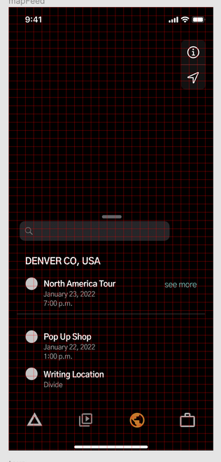
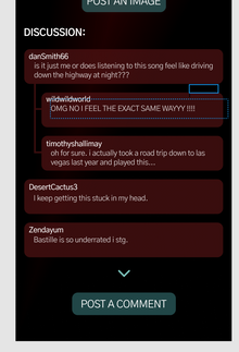
I had two people test mine out. One who was a fan of the band and the other who took this class with me. For the most part people really liked the design. I asked about the colors the readability, the spacing, and iconography. I had people go through. There were a couple things I had to walk them through because it doesn't have full functionality yet. For the most part people felt like everything was intuitive. They understood what the different icons meant. They liked the gradient backgrounds and little details like how the music "plays". The only thing that tripped people up was replying to a comment. I had it set up so that you selected the comment and it would give you the option to respond. It was suggested I do something like the "see more" button on the map for the tour. So, I went back and added that. There were also a couple mis alignment things or double arrows were there should only be one. On the map I only used an icon for the tour considering it the most important location-based info, and this confused people so I got rid of it.
I also went back and changed some of the colors.


Comments