DC#1 (Final)-My Lorde and Savior Illustrations
- assa4664
- Oct 10, 2018
- 6 min read
Updated: Dec 13, 2018
This was the first time I've ever finished something in Adobe Illustrator, and I'm really proud of it. My concept was to create movie posters to represent each song on Lorde's first album, Pure Heroine.
BRAINSTORMING:
Pretty much all of my ideas had to do with a form of entertainment: books, music, movies, etc. I went from postcards inspired by fictional places, doing modern versions of characters, to movie posters inspired by music albums. I played around with the postcards idea and the movie posters idea. The reason for this was that both allowed me a little more movement. It was a series but I wanted each one to be able to stand on it's own and be unique. I ultimately ended up with the movie poster idea because it would challenge me with a program I didn't know a whole lot about, and I could have minimalistic posters as well as more complex ones.
(these were my mind maps)
(sketches for the rejected ideas)
The idea to make movie posters was actually inspired by Halsey. For her tour for her album Badlands she made movie posters to have for VIP at her shows. I totally loved them especially because it fit with my relationship to music. When I listen to music, it's like playing a mini movie in my head. Every song will have a setting, a color scheme, a mood, etc. in my brain.

STAGE TWO-ISH: SKETCHING:
I only say ish because sketching is pretty much constant all stages of creation for me. I sketch structure for code and essays, presentations, and of course for illustration. My ideas are also constantly evolving at every stage. I don't go in knowing exactly how it's going to look. It's usually it will be something like this and then I'll go from there. Very rarely has anything turned out exactly how I picture it going in.
(sketches for chosen idea)
The first two are the sketches before even going into Illustrator and were created during the Brainstorming period. The last three all happened during when I couldn't get it to look how I wanted digitized so I needed to rework the idea a little bit.
STAGE THREE: DIGITIZING
This was the part I was the most nervous about. I've dabbled in illustrator and photoshop, but I've never finished anything and I usually began to hate how it looked pretty early on. This was a project I had to see through though, and because of that I learned so much about the tools in the program and I finished not just one illustration but 10. To create this I relied on different techniques but I have a lovely friend who actually has a tablet since Image Trace was not giving me the look I wanted.
Tennis Court
The title kind of handed me the idea for how this poster was going to look. I originally used an image trace with 16 colors for the shrubbery but hated how it looked but I used how it had circle shapes with varying colors to make the shrubbery myself.
"Baby be the class clown
I'll be the beauty queen in tears"
400 Lux
The clock was going to be super minimalistic but I didn't like the way it looked so I reworked it. I kept the simple shapes and then looked at a ton of pictures of alarm clocks on images and picked aspects of different ones while drawing to make this. The numbers represent the date the album came out.
"we're never done with killing time
can I kill it with you?"
Royals
This was initially going to be so much more complex than how it actually turned out. I used image trace on a picture of a cadillac and then erased a lot of the details to simplify it. I tried to find a drawing to appropriate but none of them had the angle I wanted. I originally going to use a palace for the background, but I didn't like how it looked so I deleted it and kept the car and made it a sunset dream instead.
"we're driving cadillacs in our dreams"
Ribs
Ribs was the only one that ended up similar to the original concept. I switched out flowers in favor of string lights. The song itself is almost nostalgic and juvenile in tone. It's about people who are starting to grow up, the uncertainty of it, and I wanted the poster to reflect it. This was when I learned about the different kind of brushes. The opaque brush was used behind the normal one to create a glowing effect, and then I used the pencil looking one because I loved the look of it.
I did use image trace for the ribs. I deleted the bits in between as well as some of the details. I also recolored and made it more opaque so it would serve more as a background.
The original artwork for the Ribs: Bubble Gum Ribs by strange
Buzzcut Season:
This was the one I struggled the most with. I didn't know how this was going to end up looking. It was going to be a night pool scene, then a day one, and then it turned out to look like a postcard inspired by the podcast Welcome to Nightvale.
I drew a bunch of lines for this one and then sized it to have a border because it fit. The space window was a last minute decision. The song does have a weird dissociation-quality to it so it felt like it fit.
"so now we live beside the pool
where everything is good"
Team
Like Ribs, this one did kind of keep the same look throughout. I used image trace for the tv, took out details, minimized color, and took a picture of a suburb, add a pixelated effect and then image traced with shades of gray to create the background for the tv.
"we live in cities
you'll never see on the screen"
Glory and Gore
I didn't know how I was going to go about this one either. I liked the idea of a sword from my original sketch so I kept that and then made it video game-esque. Like with Buzzcut Season, I drew all the lines myself. This time around with the glow, I learned there was an effect in the program already.
"Let me in the ring
I'll show you what that big word means"
Still Sane
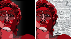
This was the first one that I finished. It was also probably the most ambitious one. I wanted to do statues. It was originally going to be a row of roman busts that they would make for their elders. I decided to change that and used Michelangelo's David. It was meant to fit one particular lyric, "only bad people live to see their likeness set in stone". This version is glorified so it fit. I used image trace in shades of gray to get the color patterns off an image, and then I traced where they changed to get the line work. I played around with backgrounds and different colors for this one but I really like the lines by themselves. This was also the poster that decided the main colors would be white, black, and red.
White Teeth Teens
This was going to literally be just a tooth, but that's boring so I didn't do that. I actually kind of wanted this to look like a slasher teen movie poster because it sounds like a bunch of privileged, East Coast teens that do illegal stuff in the woods. To make this, I downloaded a brush pack made by someone at photoshop then used photoshop to make trees. I then used image trace on a house and then erased half the house. I illuminated the window and then drew a tooth to be like a moon.
A World Alone
This song is my favorite off the album. The other songs are crazy, dark, and glitzy dreams (nightmares?). This is the song you put on in the car as you drive home late at night, and everything is quiet and still, and you're grounded. This one started with a sketch and me staring at a ton of pictures to see how light looked when in a car at night. I used the opaque brush to make little circles to be the light and then to create a night time scene and glow buttons.


Comments